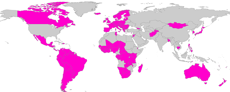
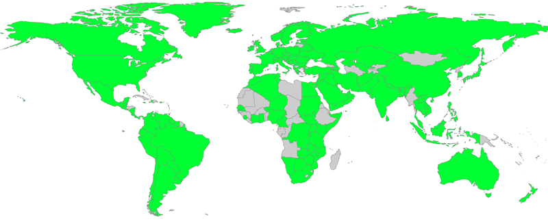
World BEYOND War has just released an updated 2018 mapping of militarism in the world. The map system can be explored and adjusted to display what you’re looking for, as well as display precise data and its sources at http://bit.ly/mappingmilitarism
Here are some examples of what it can show:
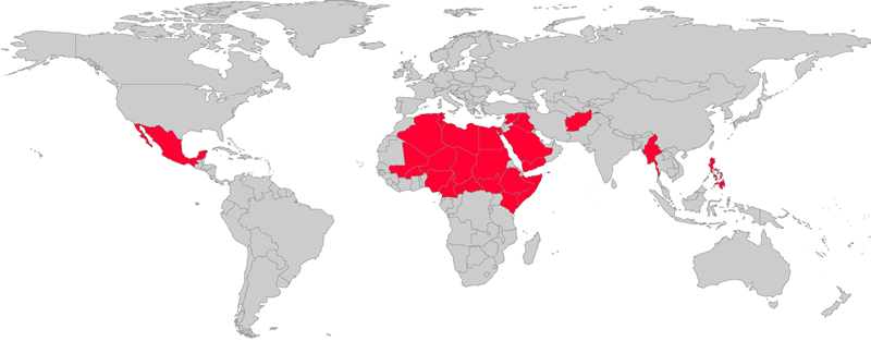
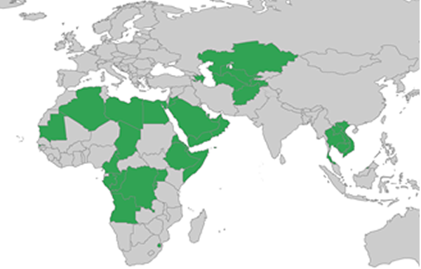
Where wars are present that directly and violently killed over 1,000 people in 2017:
Where wars are present and where wars come from are two different questions. If we look at where money is spent on wars and where weapons for wars are produced and exported, there is little overlap with the map above.
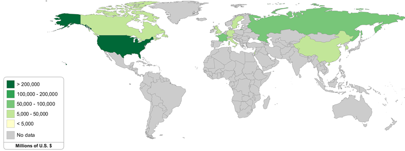
Here’s a map showing countries color-coded based on the dollar amount of their weapons exports to other governments from 2008-2015:
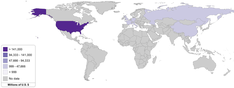
And here’s one showing the same but limited to exports to the Middle East:
Here are dictatorships that the United States sells or gives weapons to (and in most cases gives military training to):
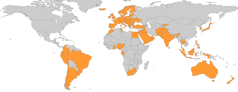
These countries purchase U.S. weapons and report on it to the United Nations:
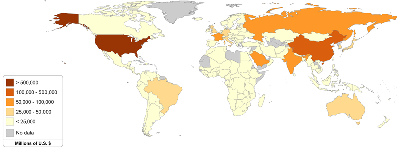
This next map shows countries color-coded based on how much they spend on their own militarism:
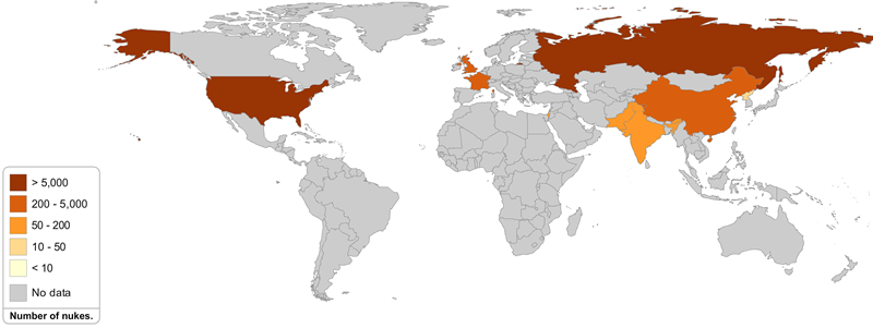
Here are countries colored based on how many nuclear weapons they have:
In the next map, every shade of orange or yellow (anything but gray) indicates the presence of some number of U.S. troops, not even counting special forces. Here’s a printable PDF.
The map system includes numerous maps illustrating steps toward peace. This one shows which nations are members of the International Criminal Court:
This one shows from which nations people have signed World BEYOND War’s pledge to help try to end all wars:
That pledge can be signed at http://worldbeyondwar.org/individual
The maps and more information about them can be found at http://bit.ly/mappingmilitarism
